Friday, September 16, 2005
Election numbers fun!
There's an election tomorrow. I haven't said anything about it here because I really don't have a lot to say - I think the most important role a government can play is to help out those New Zealander's less fortunate than me so my vote will be going leftward and that's about it.
fWhat I've always liked about elections is all the polls, graphs and pretty animations of the house filling up with red and blue (and these days purple, black, green, darker red, lighter blue....) seats. As it happens Colmar-Brunton have a website with all their poll results this year - the perfect opportunity to play with some numbers!
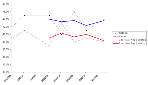
First up take a look at the way the polls have treated the big parties during this campaign. The shorter line on these graphs is a 'moving average' - the points for this line are the average of the three up to that point. The idea of the moving average is to show an overall trend and lessen the effects of 'rogue polls' that have results that aren't representative of the electorate.

The interesting bit of that graph - to me at least - is that major party's positions seem to be tied to each other. Since we have so many more parties under MMP I would have thought more 'swing voters' were left deciding between two parties on a similar piece of the political landscape - Labour/Greens or National/Act -but it seems a lot of the swing still occurs between the big boys. I did the same thing with the minor partiesbut it just gets very messy - basically Act, the Maori Party and United Future all hover between 1% and 3% while NZ first and the Greens are doing the same but between 4% and 7%
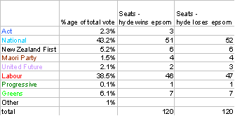
So, that's the past but what about the question everyone wants to answer? What's going to happen tomorrow? One thing you can do with numbers in a time series like this one is called 'least squares regression'. This is essentially looking at the points in the graphs above an imagining they are part of a real trend over time - the outlying points being sampling anomalies. You can then use least squares regression to draw the most likely line for this trend and extrapolate the trend line up to the Election Day. Of course, this isn't perfectly accurate, individual points in these polls varied for lots of reasons - they're not just outliers in a trend. What this sort of analysis can do is give us some idea of what might happen if the overall pattern of this election carries into tomorrow. (There are more sophisticated analyses that can, for instance, place more importance on recent polls and the like but I'm a geneticists not a statistician so this is all you're getting!)
Presuming Jim Anderton wins his seat and the Maori Party take 4 of the Maori seats here's what you get when you predict tomorrow's result in the above way:

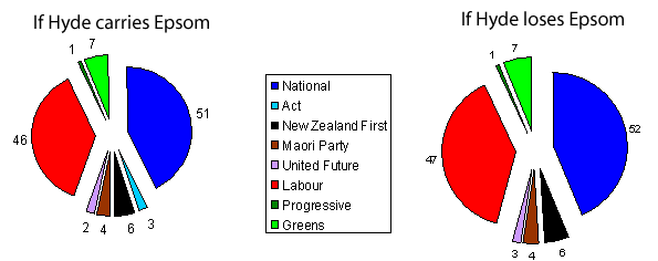
Now, I can't make pretty animations of the house filling up with coloured seats but here's a graphical representation of the state of the house if the above pans out:

2 Comments:
hermes birkin bag
ugg boots
cavaliers jerseys
ray ban sunglasses
cheap ugg boots
cheap cartier watches
nike outlet
louis vuitton borse
michael kors handbags
coach outlet
louis vuitton outlet stores
gucci outlet online
louboutin pas cher
prada sunglasses
ugg outlet
ugg uk
ugg uk
ugg boots sale
nike roshe one
uggs sale
hollister jeans
coach factory outlet
polo ralph lauren
louis vuitton purses
adidas yeezy boost
michael kors handbags
mont blanc pens cheap
coach factory outlet online
chenyingying2016912


